ITALIANO
A modern pizza ordering app for easy browsing, customizing, and checking out in a few taps.
Product • B2C • Pizza Lovers • Concept

The Challenge
Navigating the crowded food delivery market with a focus on simplicity.
The Problem
Ordering apps often overwhelm users with options and friction at checkout, leading to decision fatigue and abandoned carts.
The Goal
-
Reduce time-to-order significantly.
-
Make customization clear without clutter.

Overeviw
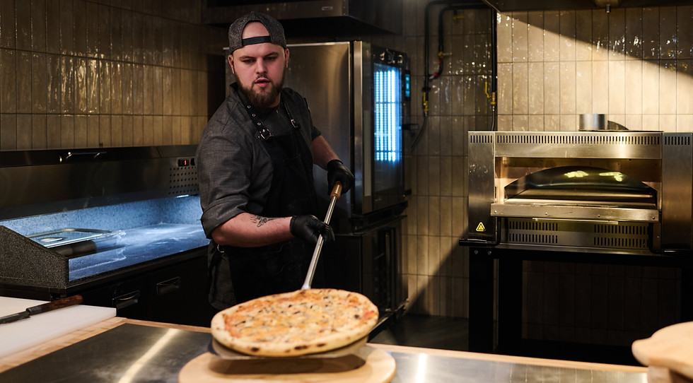
Italiano is a modern pizza app that brings authentic Italian taste straight to your doorstep. With a clean, intuitive interface, users can explore the menu, customize their order, and checkout in just a few taps.
From browsing to delivery, the app focuses on quality, speed, and simplicity—turning pizza night into an experience that feels as good as it tastes.
Buon appetito!
Logo & Branding
Combining modern minimalism with classic Italian heritage.

Brand Values
-
Authenticity: Honoring traditional recipes and methods.
-
Simplicity: Minimalist UI that puts food first.
-
Warmth: Inviting colors and friendly microcopy.


Color Palette
Inspired by fresh ingredients: tomato red, basil green, and dough white.
#D1382E
#95C250
#FAFAFA
#323030
#EAB308
Typography
Clean and legible sans-serif for UI, paired with a classic serif for display.

Design System
Atomic components ensuring consistency across the application.


App Design
Thanks For Watching
Onboarding


Home
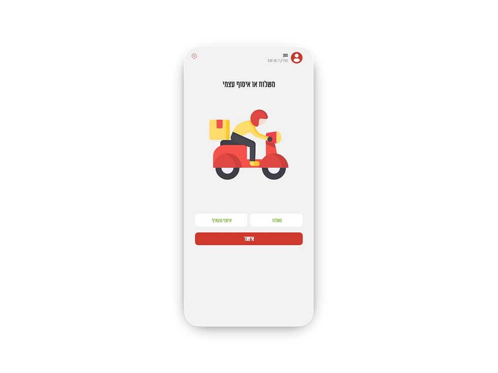
Service


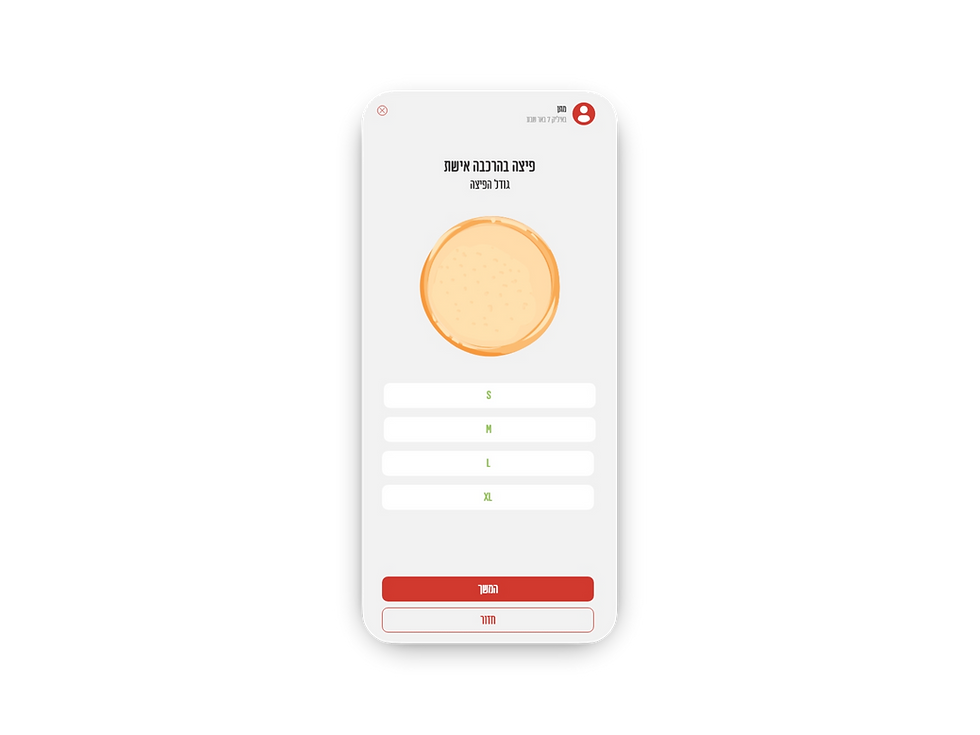
Costimaze
Addrese & Payment


